

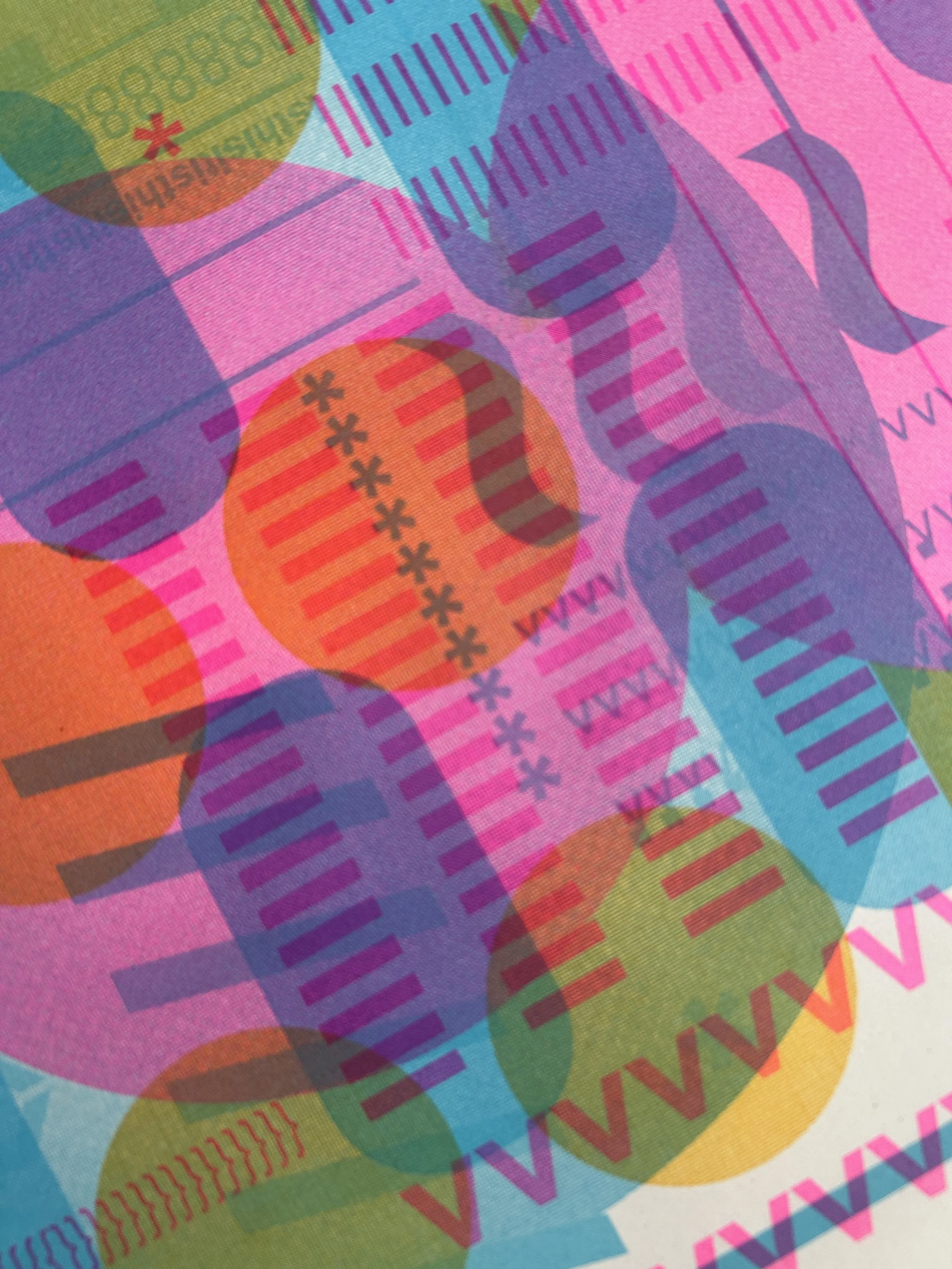
Our Riso Ink Colours
About these colours
These values are rough digital references.
Risograph inks are physical and will vary depending on paper, layering, and print settings.
BLACK
Notes: Black behaves slightly differently to other inks and is often the most reliable for consistent results. When layered, it can shift cooler and influence the tone of other colours.
GRAY
Hex: #928D88
RGB: 146, 141, 136
CMYK: 10, 10, 13, 36
Good for:
penciil-style drawings
softer typography
experimental overprints (especially on dark papers)
Characteristics:
Light Grey is less about solid coverage and more about tone and texture, expect variation, especially across larger areas.
It’s particularly good for building depth or reducing contrast without losing detail.
Notes: Riso Light Grey is a soft, warm mid-tone that prints with a slightly textured, almost pencil-like quality. It has a really natural feel, making it great for drawings, shading, and anything that benefits from a softer touch. It can also behave unexpectedly well on darker stocks, printing Light Grey onto black can produce subtle, negative-style images with a really distinctive look. One of those inks that quietly does a lot of lifting.
RED
Hex: #FF665E
RGB: 255, 102, 94
CMYK: 0, 60, 63, 0
Good for:
bold graphics and blocks of colour
attention-grabbing elements
highlights and accents
warm palettes and colour mixing
simple illustrations with strong shapes
Characteristics:
Riso Red is a warm, slightly orange-leaning red that prints bright and punchy.
It has strong coverage compared to lighter inks, but still keeps a bit of that Risograph texture, especially in larger areas.
It sits somewhere between bold and friendly, less aggressive than a pure digital red, but still very eye-catching..
Notes: Red can dominate a composition if overused, so it works best when balanced with lighter or cooler colours like Mint. On its own, it feels slightly softer and more matte, which helps take the edge off its brightness. If you want it to really scream, try printing it over Fluoro Orange. A very good “make it shout a bit” colour.
ORANGE
Hex: #FF6C2F
RGB: 255, 108, 47
CMYK: 0, 58, 82, 0
Good for:
warm palettes and colour blends
gradients and tonal transitions
illustrations with natural warmth (skin tones, sunsets, etc.)
softer alternatives to Red
layering to create richer oranges and browns
Characteristics:
Riso Orange is a warm, bright ink that sits somewhere between a true orange and a slightly red-leaning tone.
It prints vibrant and energetic, with a softer edge than Red and a more natural warmth than Fluoro inks. Coverage is fairly strong, but it still keeps Riso texture when you lower the opacity.
It can shift depending on what it’s paired with, leaning more red or more yellow depending on surrounding colours.
Notes: Orange is one of those colours that plays really nicely with others. It’s less shouty than Red but still brings a lot of warmth. It’s especially nice layered with Sunflower for glowing, almost sunburnt tones, or with Pink/Red for deeper, richer oranges. Can be really lovely for more natural-feeling work where Red feels a bit too harsh. Also a good “bridge” colour when you’re trying to connect warm and cool parts of a print.
FLURO ORANGE
Hex: #FF7477
RGB: 255, 116, 119
CMYK: 0, 55, 53, 0
Good for:
bold highlights and accents
posters and attention-grabbing elements
layering to create glowing oranges and reds
adding intensity to otherwise flat compositions
anything that needs to feel loud
Characteristics:
Fluoro Orange is a highly saturated, neon ink that prints extremely bright and eye-catching.
It’s more transparent than standard inks, which means it really comes alive when layered, either intensifying other colours or creating glowing, almost electric mixes.
On its own it can feel flat in coverage, but the brightness is unmistakable.
Notes: Fluoro Orange is less about subtlety and more about impact. It’s brilliant for pushing other colours into something much louder and more saturated. Because it’s quite transparent, it works best as part of a layer (either overprinting or underprinting) rather than as a standalone block. It definitely glows, but you’ll get the strongest effect when it’s sitting on top of or next to other colours. Fluoro Pink’s hotter sibling.
SUNFLOWER
Notes:
Sunflower is much more opaque than you’d expect — even at lower percentages it still holds its presence on the page. Because of that, it’s great for gradients and larger areas where other yellows might disappear. It pairs especially well with:
Orange for warm, glowing tones
Greens for more natural palettes
One of those colours that can do both subtle and bold, depending on how you use it.
GREEN
Good for:
strong backgrounds and base layers
smooth gradients and tonal work
warm highlights that still hold their own
layering to create rich oranges and greens
illustration work where yellow needs to actually show up
Characteristics:
Riso Sunflower is a warm, slightly golden yellow with more depth than a standard bright yellow.
Unlike most yellows, it has surprisingly strong coverage and stays visible even at lower percentages. It can print quite boldly, while still keeping a soft, warm tone.
It’s capable of producing really smooth gradients, making it more versatile than you might expect from a yellow ink.
Hex: #FFB511
RGB: 255, 181, 17
CMYK: 0, 29, 93, 0
Notes: Green is a bit of a grower. It can feel quite “preschool green” at first.. bright, simple, and slightly unforgiving, but once you start working with it, it really earns its place. It comes into its own when layered or balanced with other colours, where it feels much more considered and less flat. One of those colours that might not be your favourite at first, but you end up using all the time. A bit “preschool’’ … until it isn’t.
TEAL
Good for:
bold graphic shapes
illustration work (foliage, flat colour areas)
layering to create deeper greens and cooler tones
balancing warm palettes
adding structure without using black
Characteristics:
Riso Green is a mid-tone, slightly cool green with a bright, almost “classic” feel.
It prints with solid coverage and a clean finish, sitting somewhere between bold and flat depending on how it’s used.
On its own, it can feel quite strong and uncomplicated, but it becomes much more versatile when paired with other colours.
Hex: : #00A95C
RGB: 0, 169, 92
CMYK: 73, 0, 81, 0
Notes: Teal is one of the most commonly used Riso colours, and for good reason. It’s reliable, strong, and easy to build a palette around, which is probably why it shows up everywhere. That said, it can start to feel a bit overused if you’re not careful, so it’s worth thinking about how you combine it with other colours to keep things interesting. Works especially well with Fluoros for high-contrast, classic Riso palettes. A very dependable colour, You will use this at some point. We all do… just maybe don’t reach for it every time.
MINT
Good for:
graphics and flat colour areas
backgrounds that need depth
linework when you want something softer than black
layering with warm colours for contrast
prints where you want a clean, graphic feel
Characteristics:
Riso Teal is a rich blue-green ink that sits between a deep cyan and a muted turquoise.
It prints with strong coverage and a smooth, even finish, making it feel quite “complete” as a colour on its own. It leans slightly cool and can read quite graphic compared to softer inks.
Because it’s fairly saturated, it holds its own well in a composition and doesn’t get lost easily.
Hex: #00838A
RGB: 0, 131, 138
CMYK: 100, 1, 40, 7
Notes: Mint is one of those inks that looks gentle but behaves quite confidently. Mint holds its own much more than you’d expect. Works especially well with Red and Black for a strong high-contrast palette and gives darker colours depth without heaviness. It’s a really nice way to introduce colour without everything feeling too intense. Soft, but not shy.
AQUA
Good for:
layering with darker colours for contrast
illustration work with a lighter palette
balancing stronger colours
replacing white space with something more intentional
Characteristics:
Riso Mint is a soft, cool green with a slightly blue-leaning tone.
It prints surprisingly opaque, holding its colour well on darker paper stocks. Despite being a lighter ink, it doesn’t disappear like some pastels can.
It has a clean, fresh feel that sits somewhere between subtle and graphic depending on how it’s used.
Hex: #82D8D5
RGB: 130, 216, 21
CMYK: 38, 0, 16, 0
Notes: Aqua is one of those colours that instantly makes something feel more “Riso”. It can feel quite strong for a lighter colour, so it’s worth balancing it with softer tones if you don’t want it to take over. Sits somewhere between playful and graphic… depending on how you use it.
MEDIUM BLUE
Good for:
bold graphic work
layering with warmer colours for contrast
creating lighter blue tones without losing visibility
using with other fluro colours
prints that need a fresh, slightly electric feel
Characteristics:
Aqua is a bright, cool blue with a slightly cyan-leaning tone.
It prints clean and vibrant, sitting somewhere between a light blue and a more electric, almost digital-feeling colour. It’s lighter than deeper blues but still holds its presence well on the page.
Hex: #5EC8E5
RGB: 94, 200, 229
CMYK: 49, 0, 11, 0
Notes: Medium Blue is very straightforward to use, it behaves predictably and doesn’t throw too many surprises. A good all-rounder when you want blue without going too dark or too bright.
RISO-FEDERAL BLUE
Good for:
clean graphic work
linework and illustration
backgrounds that need colour without too much weight
layering to create deeper blues
more traditional or “classic” palettes
Characteristics:
Riso Medium Blue is a bright, classic blue with a clean, slightly cool tone.
It prints clearly and evenly, with enough saturation to feel bold without being too heavy. It sits comfortably between lighter blues like Aqua and deeper tones like Federal Blue.
It feels familiar and easy to work with, a very “true” blue.
Hex: #3255A4
RGB: 50, 85, 164
CMYK: 87, 59, 0, 0
Good for:
large, bold backgrounds
text and linework when black feels too harsh
darker, moodier compositions
layering to create near-black tones
more refined or limited colour palettes
Characteristics:
Riso Federal Blue is a deep, rich blue with a slightly muted, inky quality.
It prints with strong, even coverage and feels much heavier than lighter blues. It leans slightly warm, giving it a more classic, almost vintage tone compared to cooler, brighter blues.
It’s one of the darkest inks in the palette without being black.
Notes: Federal Blue is a great alternative to black when you want depth without full contrast. It can feel quite dominant, so it’s best balanced with lighter or warmer colours. Riso’s answer to Black, but with feelings. This is the colour that makes people go “oh this feels more considered now”.
PURPLE
Hex: #3D5588
RGB: 61, 85, 136
CMYK: 100, 65, 1, 17
Notes: Riso Purple is deceptive, looks fun in theory, behaves like a shadow goblin in practice. This is one of those inks where opacity really matters. At full strength it can read almost black, so it’s often more interesting when used at lower percentages to let the colour come through.
Works really well for:
linework that feels softer or slightly off-black
subtle tonal overlays
Can absolutely slap for bold linework, but easy to overdo if you’re not careful.
A bit of a hidden colour — you have to work with it to get the best out of it.
FLURO PINK
Good for:
linework as an alternative to black
low-opacity overlays to introduce subtle colour
moody or darker compositions
adding depth without using full black
experimental layering
Characteristics:
Riso Purple is a deep, saturated violet that can read almost black in heavier coverage.
It prints dark and intense, with a slightly warm, inky tone. In solid areas it can lose a lot of its “purple-ness” and behave more like a near-black.
At lower opacities, though, the hue comes through much more clearly, revealing a rich, slightly unusual colour.
Hex: #765BA7
RGB: 118, 91, 167
CMYK: 61, 73, 0, 0
Notes: Fluoro Pink is one of the most recognisable Riso colours (and probably the most overused.) It’s very easy to reach for, and very easy to overdo. Because it’s quite transparent, it works best as part of a layer rather than a standalone block. Fluoro Pink = CEO of Riso, it’s iconic, chaotic, and addictive.
BUBBLEGUM
Good for:
bold highlights and accents
posters and high-impact graphics
layering to create vibrant purples and reds
anything that needs to feel loud
classic high-contrast Riso palettes
Characteristics:
Fluoro Pink is an extremely bright, neon ink that prints with intense saturation and glow.
It’s more transparent than standard inks, which means it really comes alive when layered, either amplifying other colours or creating vivid, high-energy mixes.
On its own, it can feel flat in coverage, but the brightness is unmistakable.
Hex: #FF48B0
RGB: 255, 72, 176
CMYK: 0, 72, 31, 0
Hex: #000000
RGB: 0, 0, 0
CMYK: 0, 0, 0, 100
Notes: Bubblegum is Fluoro Pink’s calmer sibling. Because it’s more opaque, it’s very well behaved, it can sit on top of other inks or tuck itself underneath without causing drama. Very …demure. An excellent “I want pink but I also want control” colour.
Good for:
softer palettes and backgrounds
illustration work and tonal areas
layering both under and over other colours
replacing Fluoro Pink when you want something less intense
prints that need warmth without shouting
Characteristics:
Riso Black is the most stable and predictable ink.
It prints clean, dries quickly, and gives strong, solid coverage. It tends slightly cool (blue-toned), especially when layered with other colours.
Characteristics:
Riso Bubblegum is a soft, warm pink with a slightly muted, pastel feel.
It prints more opaquely than Fluoro Pink, giving it a more solid, even coverage. It still keeps some Risograph texture, but feels calmer and more controlled overall.
Because of that opacity, it can sit comfortably both on top of and underneath other inks.
Hex:: #F984CA
RGB: 249, 132, 202
CMYK: 5, 48, 0, 0
Good for:
text and type
linework and detail
high contrast areas
overprinting with other colours